CASE STUDY
Kingdom Creations
MASCOT DEVELOPMENT & BRAND IDENTITY EXPANSION
1. THE CHALLENGE (The Why)
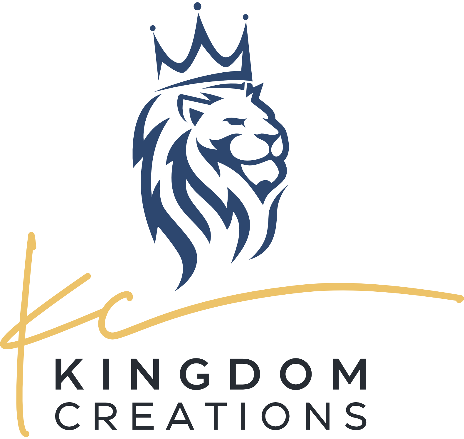
The Kingdom Creations logo does exactly what a logo is supposed to do: it marks the brand, carries the identity, and holds the weight of the name. The crowned lion in profile is strong, clean, and recognizable. However, a logo is static. It sits on a shirt or a business card and communicates a feeling, but it doesn’t move with you.
I wanted a character: something that could show up across platforms, carry the brand personality in motion, and feel like it belonged in a conversation rather than just on a wall. The lion was already present in the mark; the question was whether I could bring him to life without losing what made the original work.
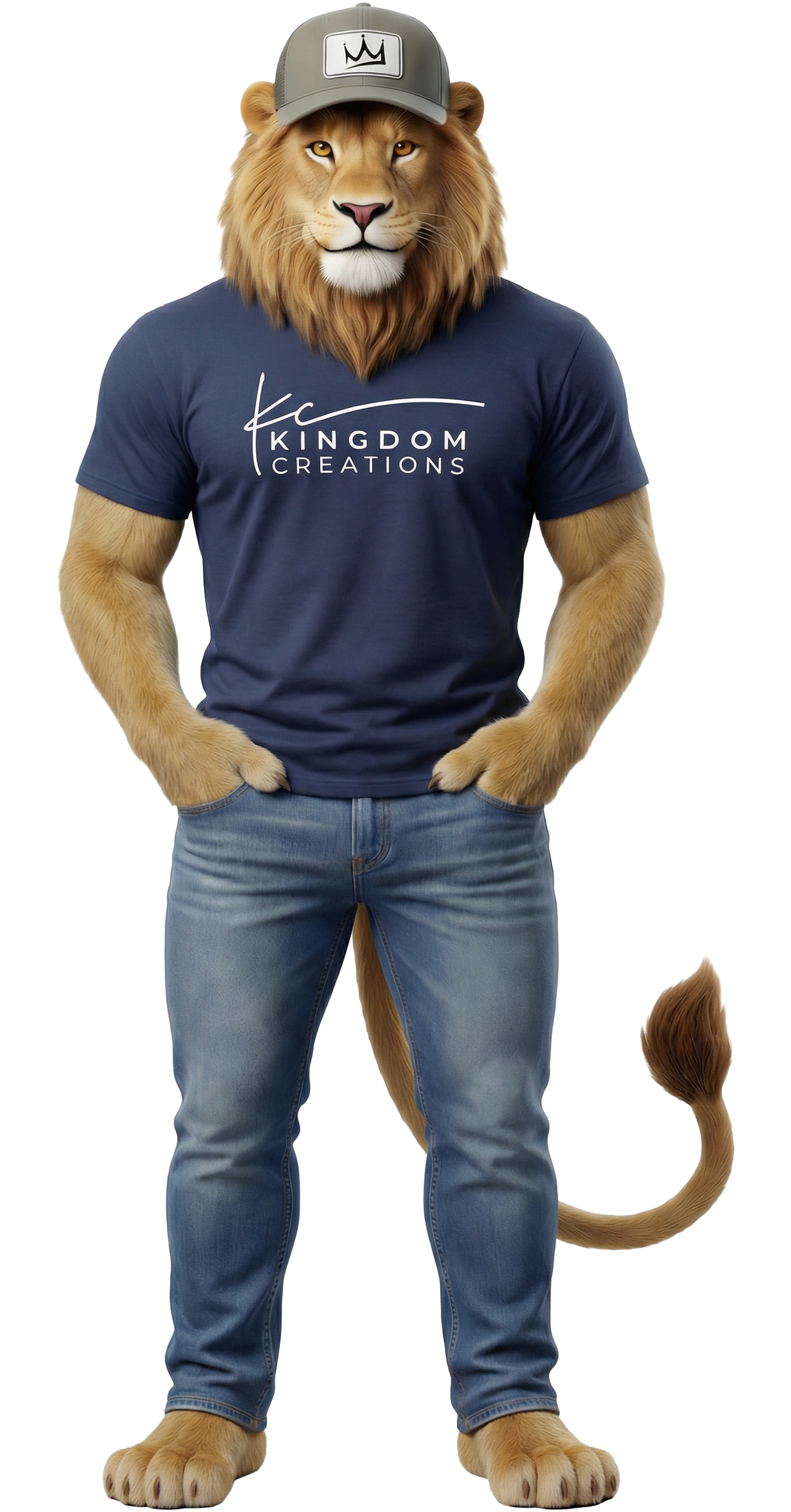
The vibe I sought was approachable but not soft, and confident but not corporate. I envisioned a mascot that looks like he actually wears the apparel because he does. He has the KC hat, the branded hoodie, and the jeans. He is not a logo holding a shirt up on a hanger; he is a character who represents the shop the way I would want to represent it myself.
2. THE ANCHOR (Where it Started)
The crowned lion profile served as the creative brief. Every decision in the mascot development came back to that mark: the regal posture, the directional gaze, and the crown. The goal was not to replace the logo; it was to pull the spirit of it off the page and give it somewhere to go.
The KC script, the gold, and the deep navy were essential brand elements that had to carry over into the mascot's apparel and overall presence. This ensures that both the logo and the mascot always read as members of the same family.
3. THE PROCESS (The Why)
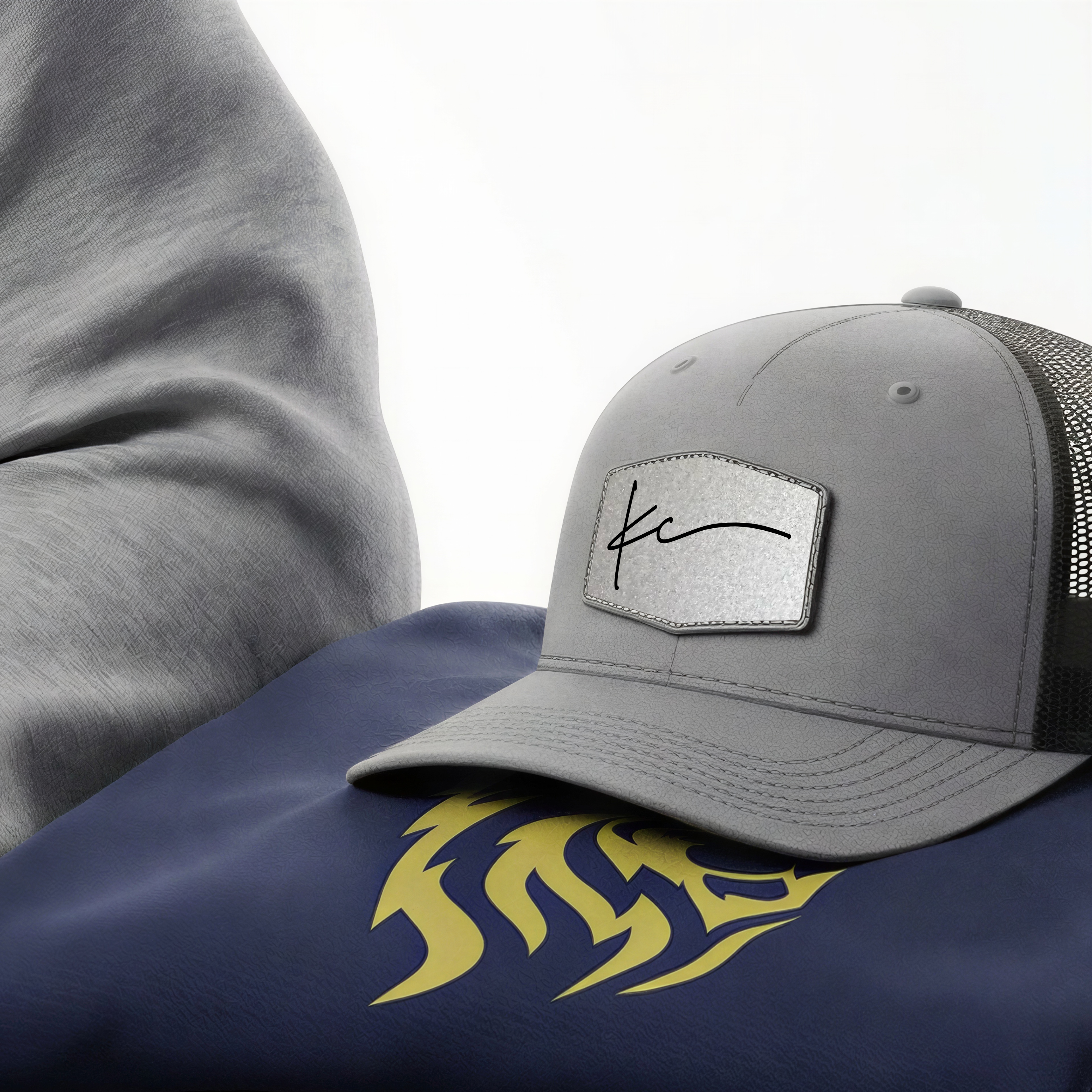
Character design. I used the original logo as my creative reference point and built detailed AI prompts to generate a photorealistic 3D rendering of an anthropomorphic lion. He is upright, full-bodied, and dressed in Kingdom Creations apparel. The prompts were highly specific, calling for a golden-brown mane with natural highlights, amber eyes, a friendly but confident expression, and clothing details that matched real KC products. This included the gray trucker cap with a branded patch, the navy tee, and the heather hoodie with the KC script. I was not generating a generic lion character; I was directing toward a specific brand representative.
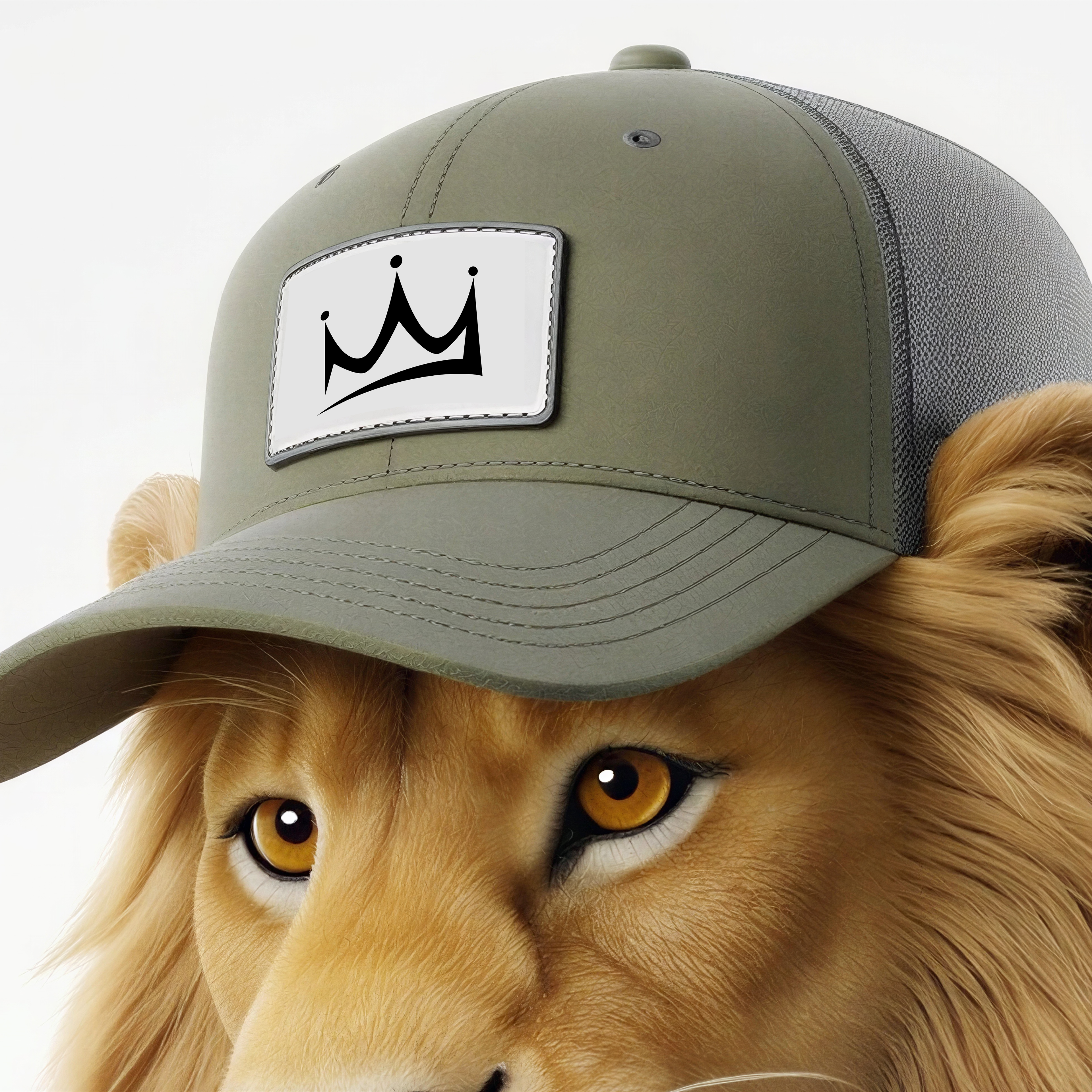
Technical iteration. Getting the branding right on the apparel required significant prompt work. The KC logo on the hat patch, the wordmark placement on the chest, and the hoodie colorway required iterative refinement across multiple generations. These details were necessary to ensure the items read as actual Kingdom Creations products rather than generic AI clothing. Flux/Nano Banana 2 handled the photorealism, while the creative direction came from understanding exactly what the brand needed to look like on a physical body.
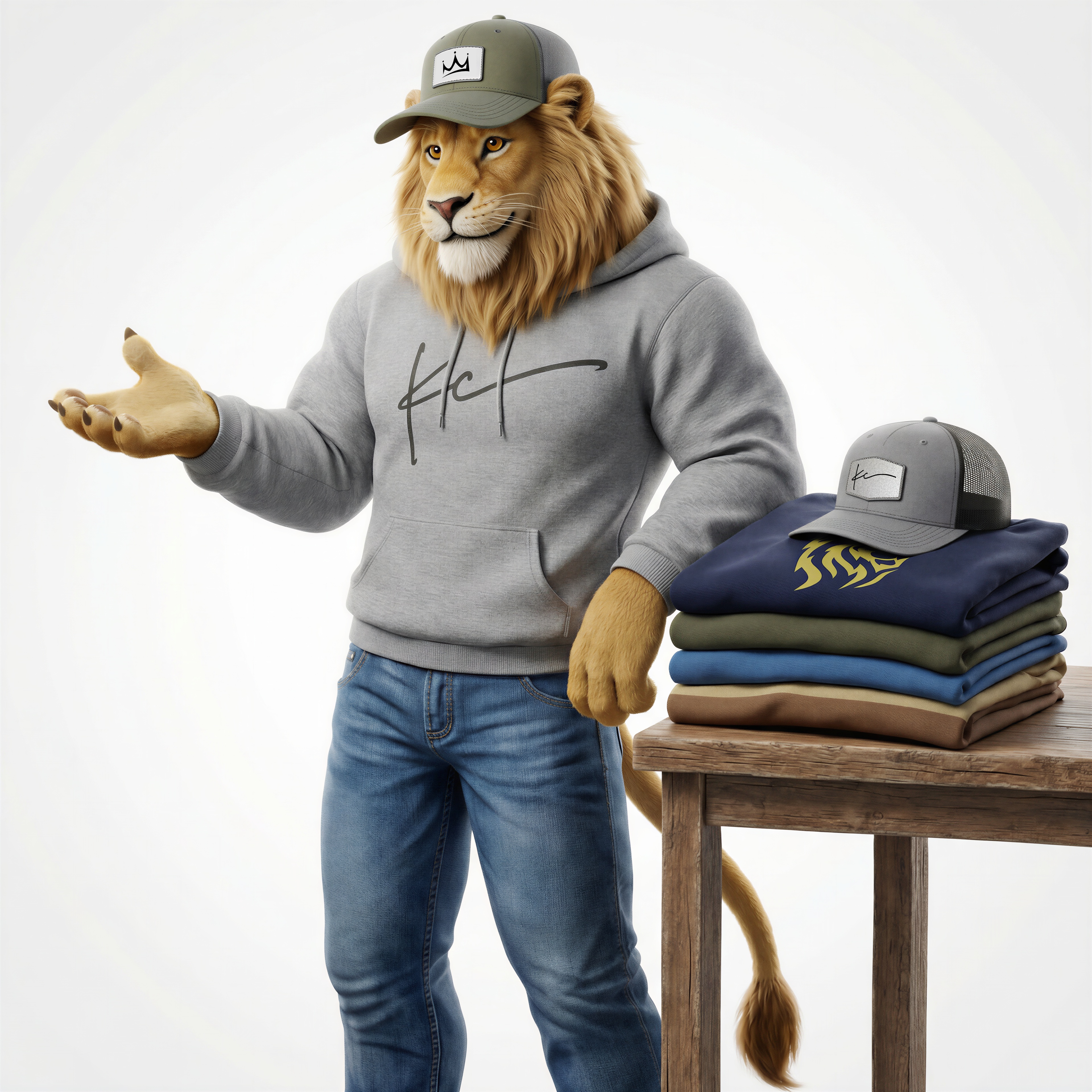
Consistency across poses. Maintaining character consistency between the standing hero shot and the production-focused scene required anchoring each prompt to the same core character description: the same mane color, facial structure, apparel, and proportions. The table scene added environmental context, such as stacked folded apparel and the trucker cap, while keeping the lion's identity locked. It is the same character in a different moment.
IMAGE GENERATION: Midjourney & Flux / Nano Banana 2
METHOD: Iterative prompt refinement
4. THE EXECUTION (The Result)
The mascot has range. He can show up on social media as the face of a product drop, walk through a video animation for a brand story, or sit in a process guide as a visual explainer for how Kingdom Creations works. He is a virtual spokesperson who wears the product and represents the brand personality, scaling across every platform without requiring a physical photo shoot.
This separates a shop with a mascot from a shop with just a logo. While many screen printing operations are competing on price and turnaround, Kingdom Creations is competing on identity. The lion gives us a character to build around, providing someone the community can recognize, relate to, and remember. That is not something you can screen print; that is brand equity.
More practically, this mascot was built entirely through an AI-directed creative workflow from start to finish. There was no illustrator retainer or character design agency. It was achieved through a clear creative brief, deep knowledge of the brand, and enough prompt precision to get a photorealistic result that truly belongs to Kingdom Creations. This is the proof of concept, and it works.
5. VISUAL CHECKLIST
[x] The Anchor: The original logo (logo.png) to show where it started.
[x] The Evolution: Side-by-side shots of the lion in different gear.
[x] The Detail Shot: A crop of the hat or the shirt logo to show that even in a 3D render, the brand stays sharp.